
All of the liveries for the 2023 grid have been revealed and there haven’t been any massively ugly designs but which is best? Which is worst? This is my take on it (which you may or may not agree with).
10. Red Bull
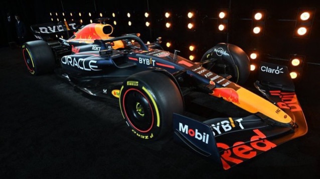
There’s nothing inherently wrong with the Red Bull livery and it serves a purpose of being an effective moving billboard but it’s just so boring. It doesn’t look any different to last year and is therefore to me very unimaginative.
9. Alpine
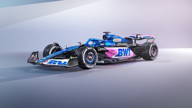
Another difficult game of ‘spot the difference’ with the new Alpine meaning it ranks pretty low. There’s no bits that excite me and it just looks the same. The pink livery is considerably worse too – awful thing!
8. Aston Martin
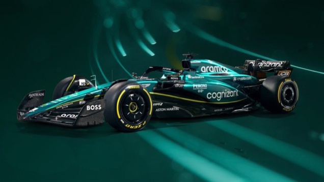
Yet another livery that looks the same as last year. At least with this one it does look really good and probably didn’t need much changing. It doesn’t look bad, it just looks exactly the same (bar a few sponsor switches).
7. Alfa Romeo

I know a lot of people love this livery but it just doesn’t do it for me. It looks like a Ferrari and I don’t like sharp lines and harsh colour changes.
6. Haas
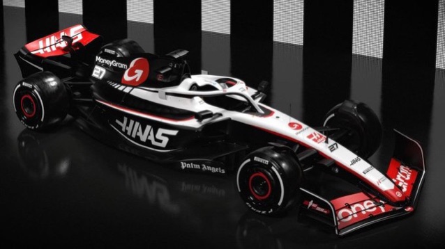
I really like the new Haas livery and for me 4,5,6 are incredibly close and may change throughout the season. The black and white looks very cool however the MoneyGram logos (rather than name) are a little too big for my liking.
5. Williams

Now this is a bit of another cut and paste car but the permanent inclusion of the Duracell battery rollhoop is worthy of putting it higher up the list. It also looks absolutely gorgeous with an actual design rather than a wall of stickers (even though that’d be better for the team).
4. Ferrari
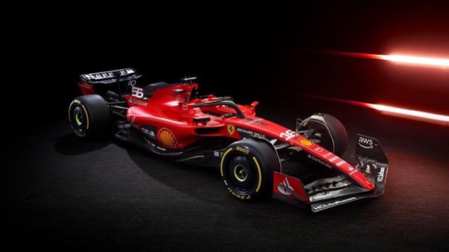
I really like this year’s Ferrari, I know they are only slight iterations but the lettering on the rear wing is incredibly cool and the smattering of Italian flags are also nice.
3. McLaren
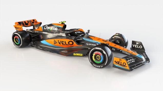
I really like this McLaren: the extra blue and black definitely makes it look a bit cooler and less like a moving tangerine. The Google wheel covers are still pretty nice too.
2. Mercedes
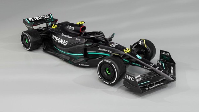
And they’ve gone back to black!! The mostly bare carbon livery is exactly what they needed and the silver definitely made it look less cool. This will definitely look menacing in the mirror of the other competitors.
1. AlphaTauri
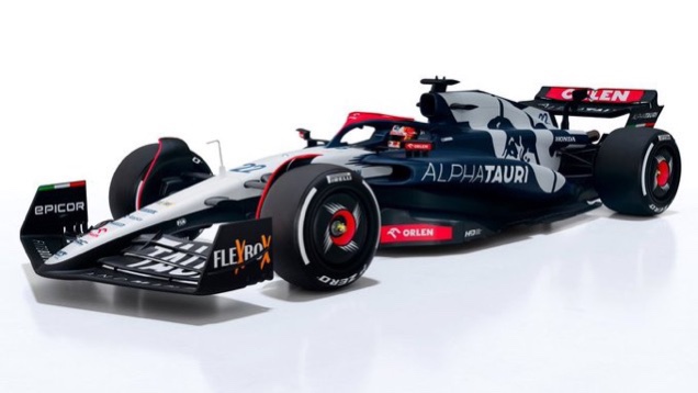
A pretty surprising number one (or at least that’s my opinion based on other people’s ranking) but I just love the new AlphaTauri. The addition of the red has made it look more exciting and navy was a nice colour anyway. Let’s just hope it doesn’t lurk at the back of the grid.
That’s my opinion on the liveries for this year. I’d imagine yours will be vastly different.
Do comment your thoughts below.

Leave a comment